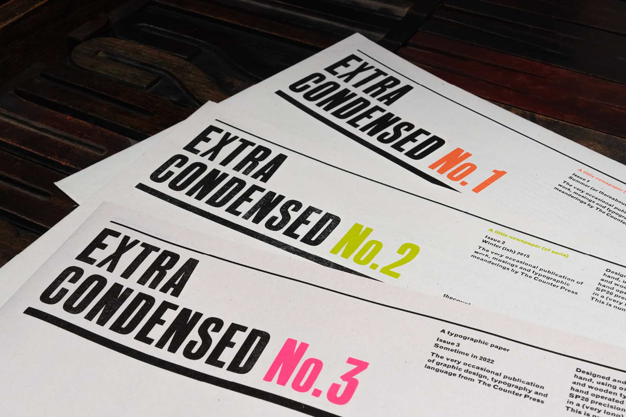
Extra Condensed No. 3
This issue of Extra Condensed has been a long time in the making, arriving some 6 years after the last, and 5 years after it was started, having been delayed several times by work commitments, a relocation across country and the inevitable impact and hold ups of Covid. But it returns bigger, bolder and all the better for its elongated gestation period.
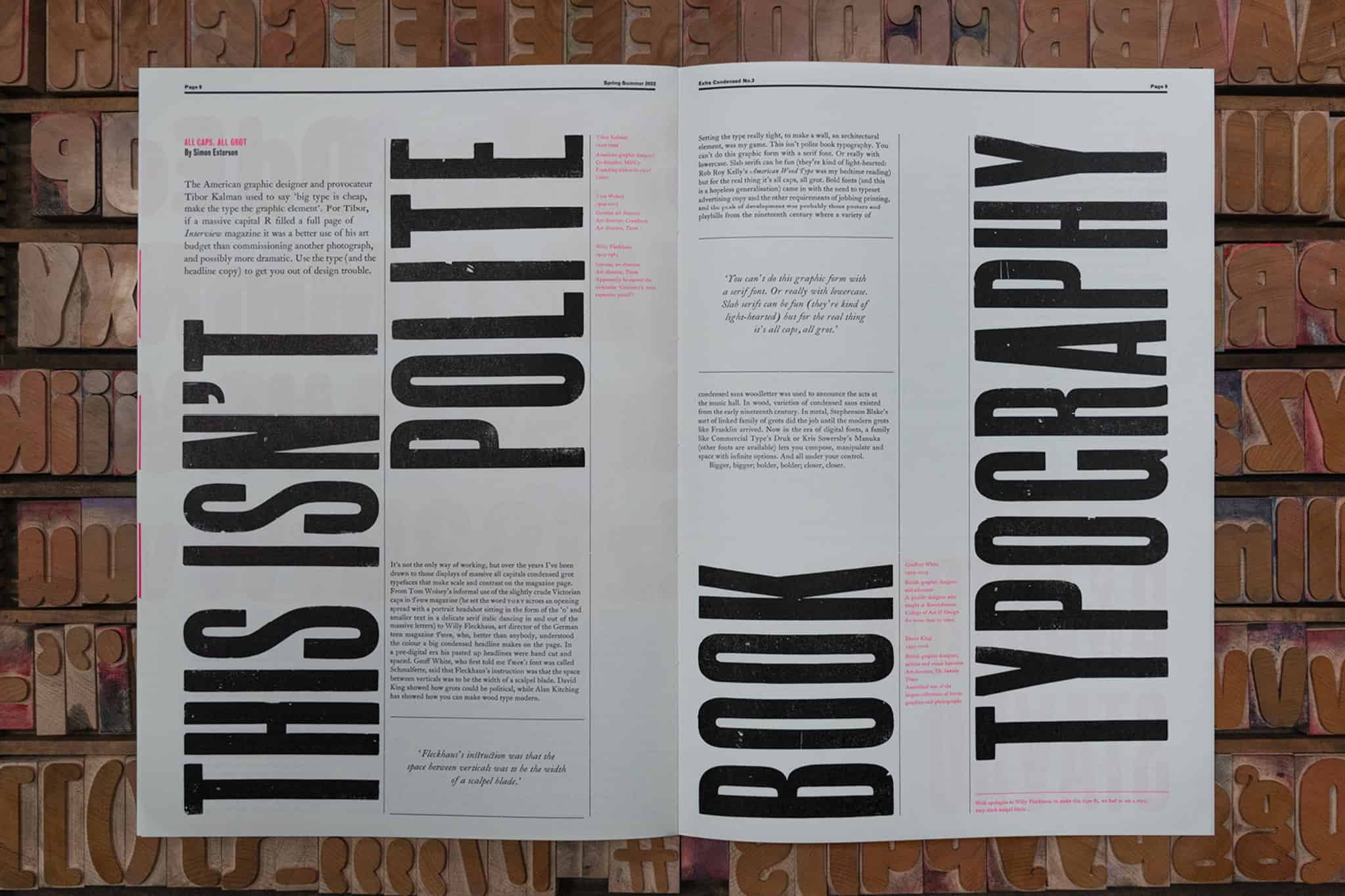
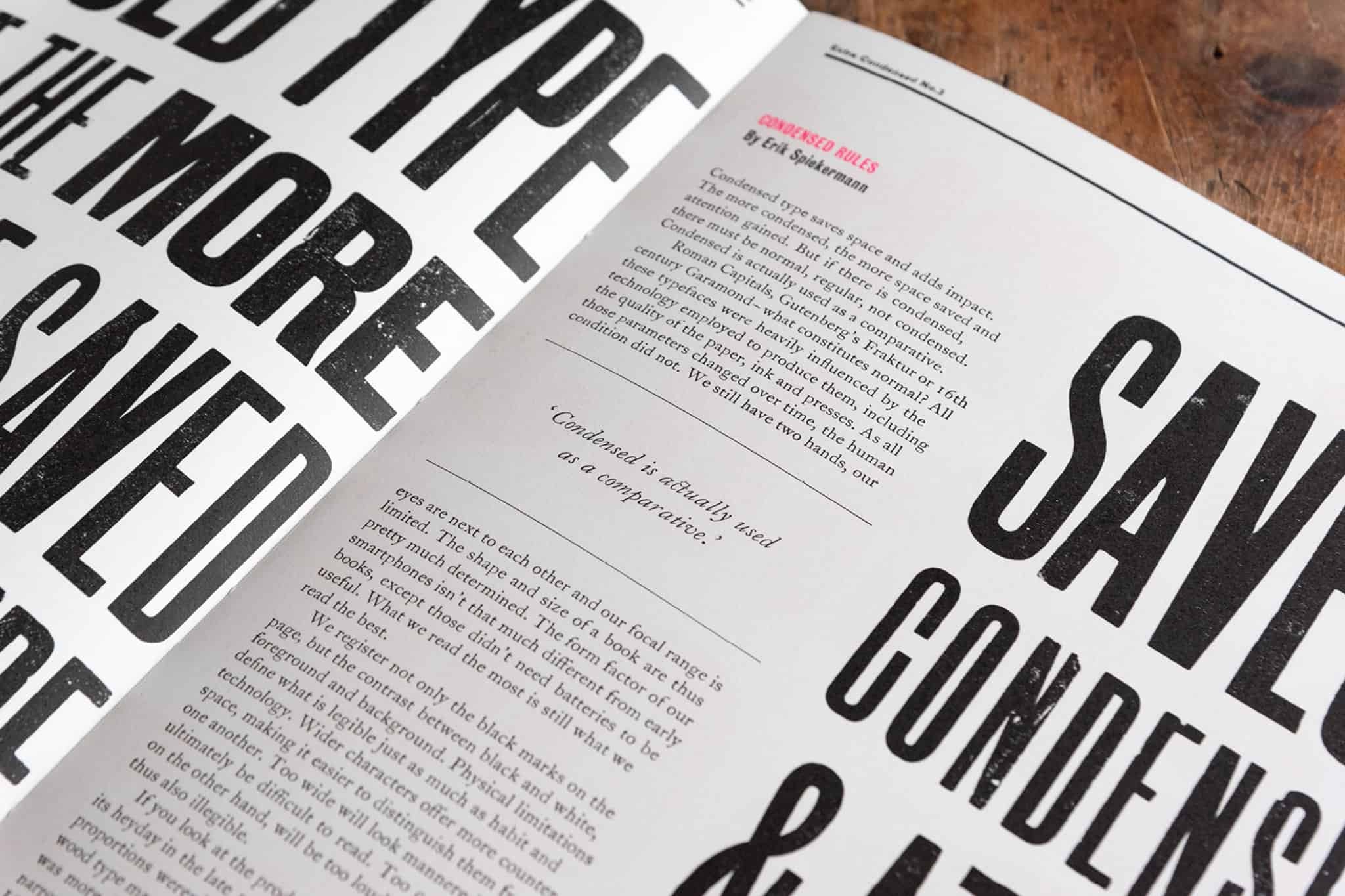
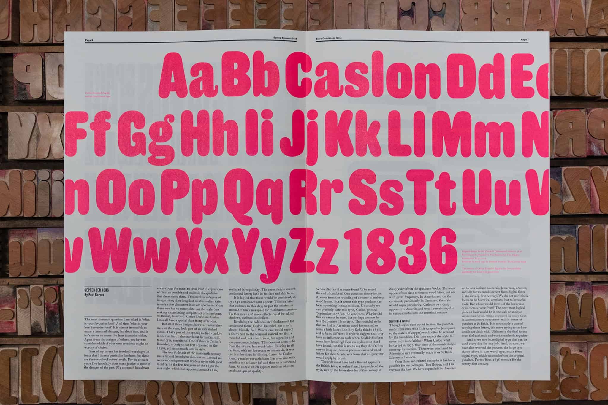
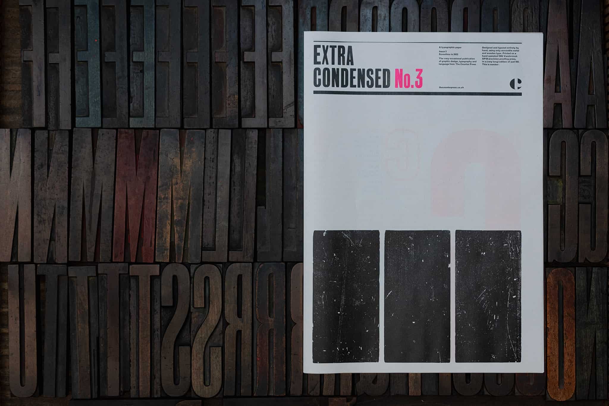
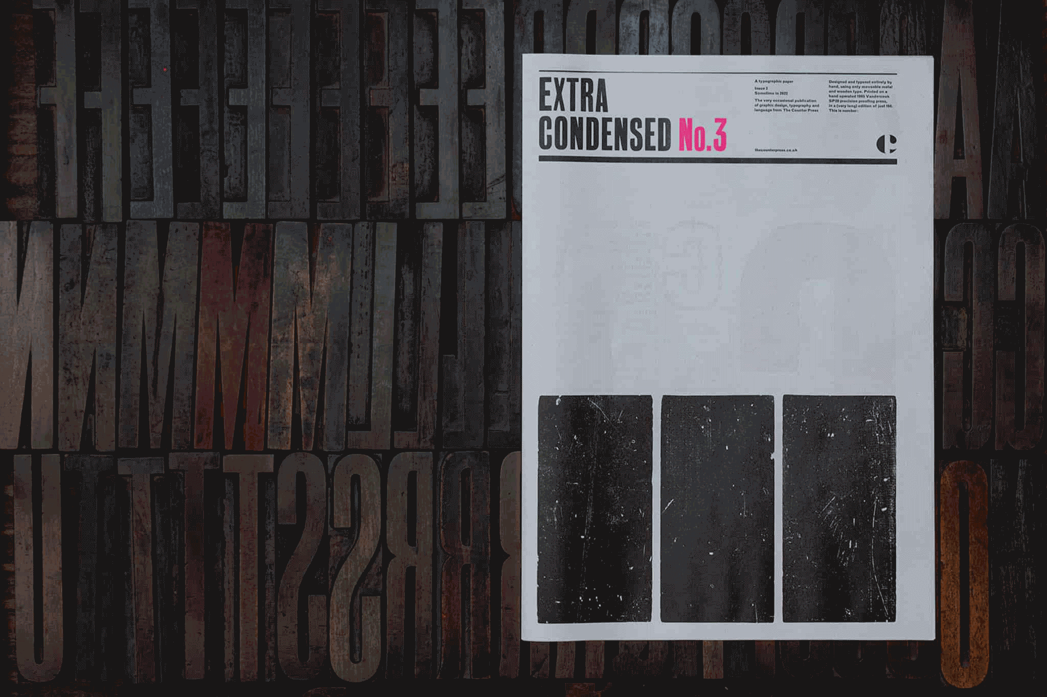
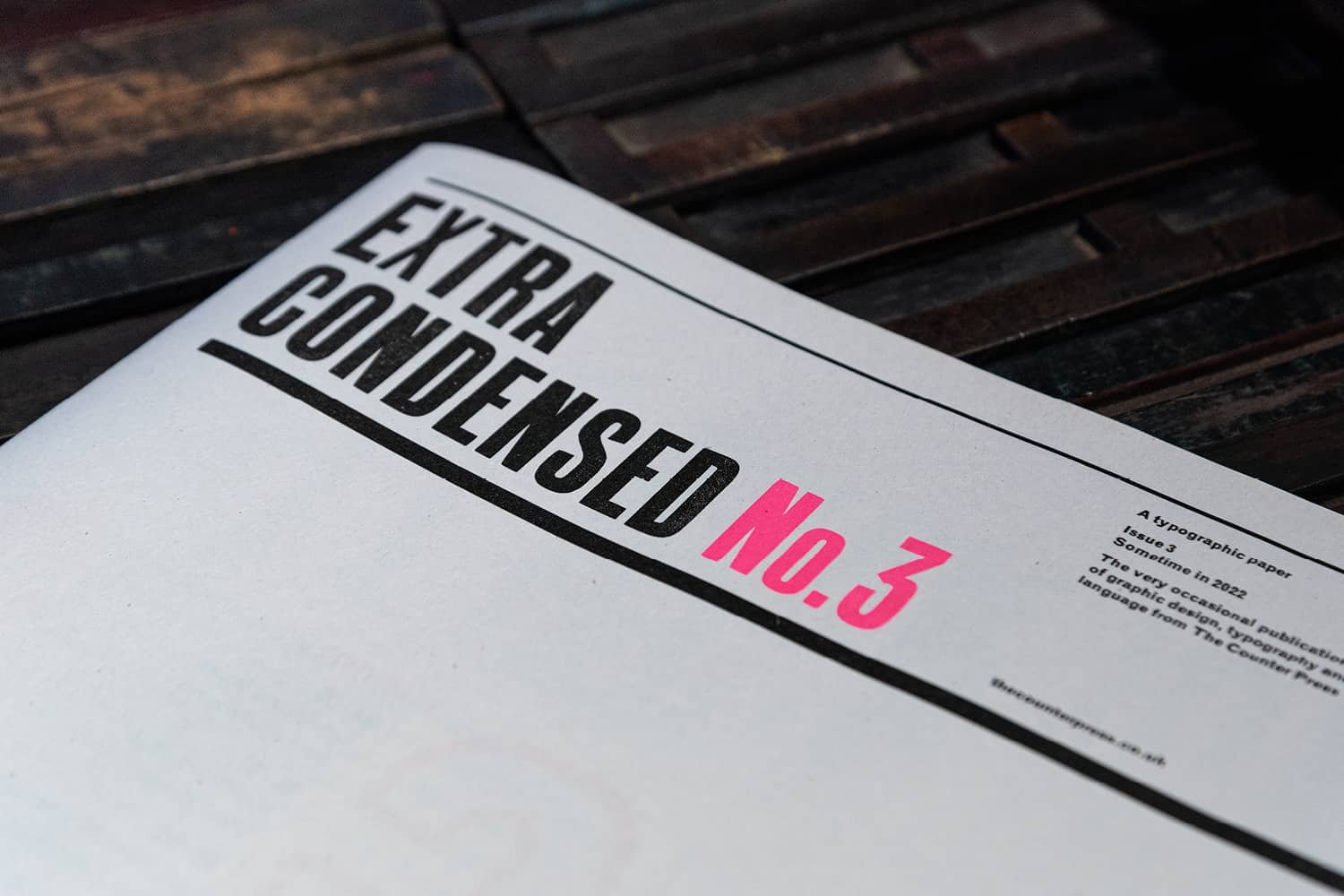
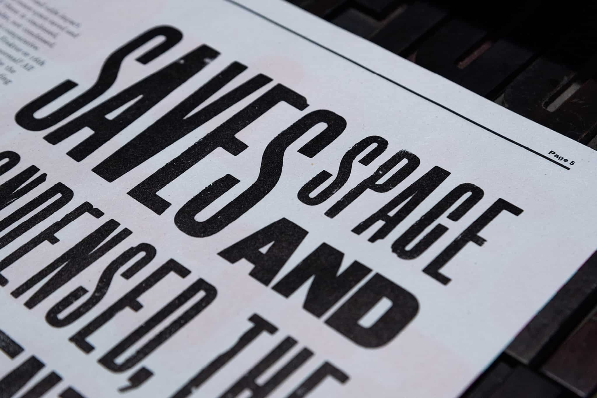
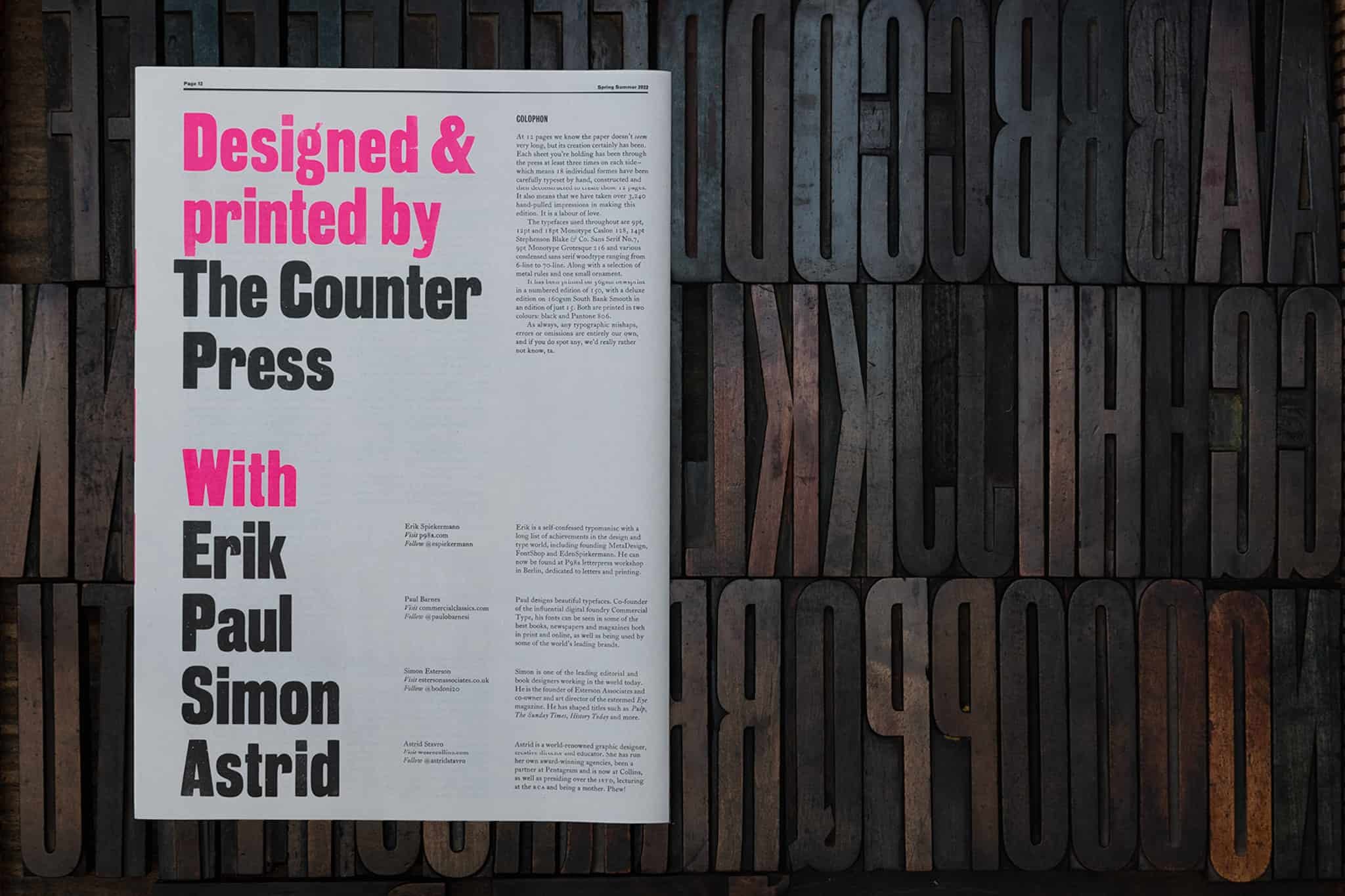
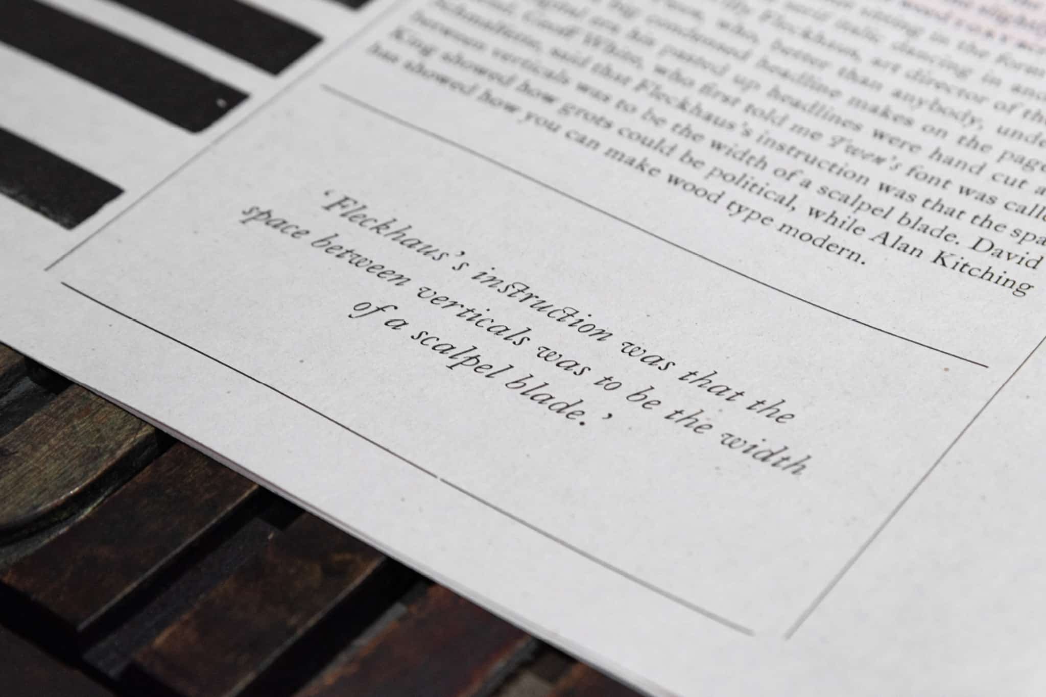
This time round, the issue takes condensed typography as its theme and features exclusive articles by some of the world’s finest designers: Erik Spiekermann, Astrid Stavro, Paul Barnes, and Simon Esterson. Each bringing their own view of what that means to them and their work. It’s an unashamed celebration of these humble grotesque and sans serif letterforms, richly brought to life through a combination of delicate metal type and larger, more expressive wood letter – the condensed type around which the issue revolves.
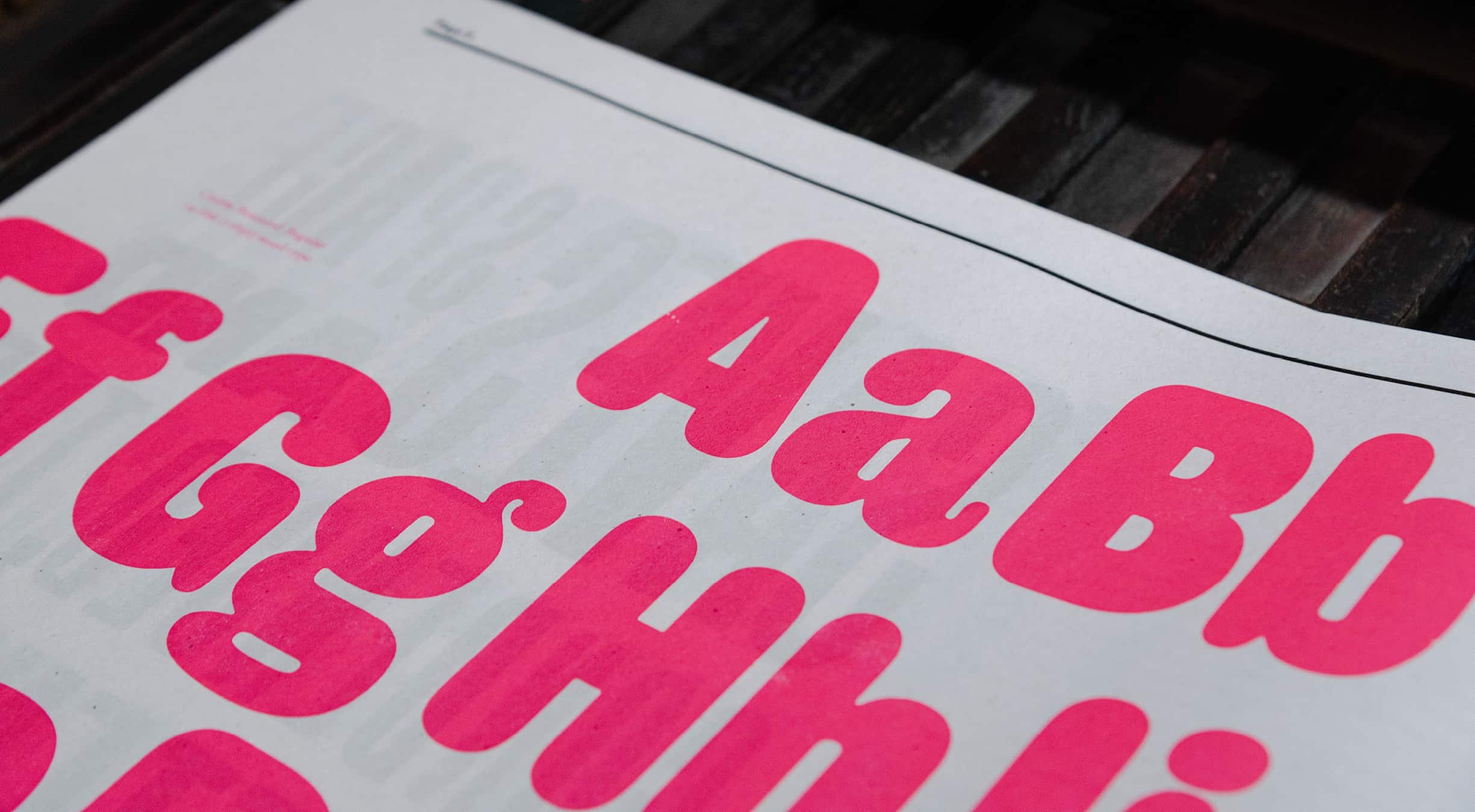
Hand typeset in 9pt, 12pt, 18pt and 22pt Monotype Caslon Series 128, and Monotype Grotesque 216, both cast by the Whittington Press, with original 14pt Stephenson Blake Sans Serif No.7, and a range woodletter, including a unique new cutting of Caslon Rounded in 14-line for wood type, by Paul Barnes and Commercial Type.
Printed in two colours, black and Pantone 806, on 90gsm newsprint in a limited edition of 150, with a special collectors edition printed on archival 160gsm South Bank paper and hand sewn in white thread limited to just 15 copies.
COLOPHON
Standard edition of 150
Deluxe edition of 15
12 pages
304mm x 431mm
—
8pt Monotype Grotesque Bold 216, 8pt, 12pt & 18pt Monotype Caslon 128, 14pt SB&Co Condensed Sans Serif No.7 & various wood letter
—
Standard edition
90gsm Newsprint
Custom printed pink envelope
Deluxe edition
160gsm South Bank Smooth with a hand sewn binding.


DELUXE EDITION