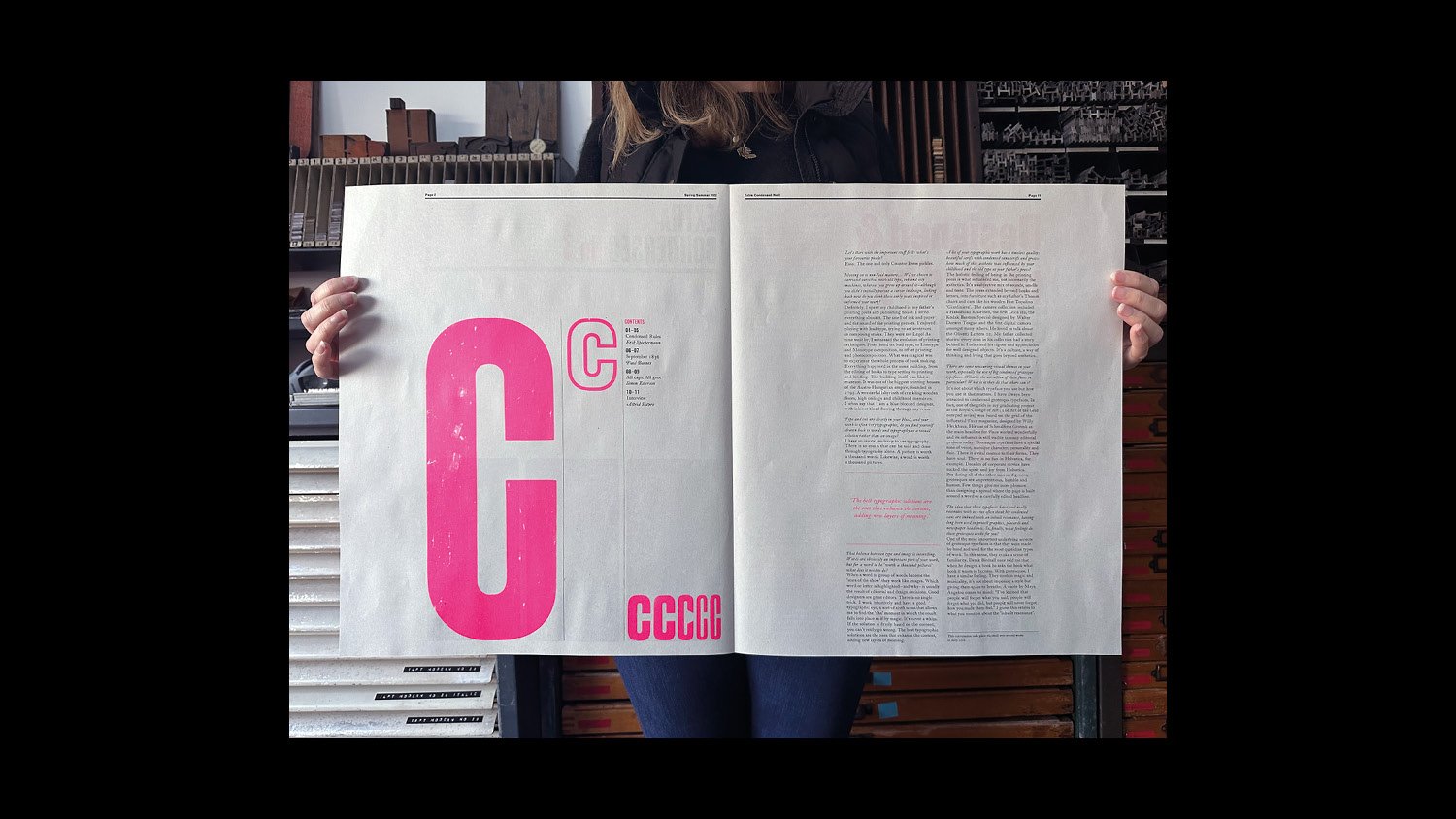
The making of Extra Condensed No.3

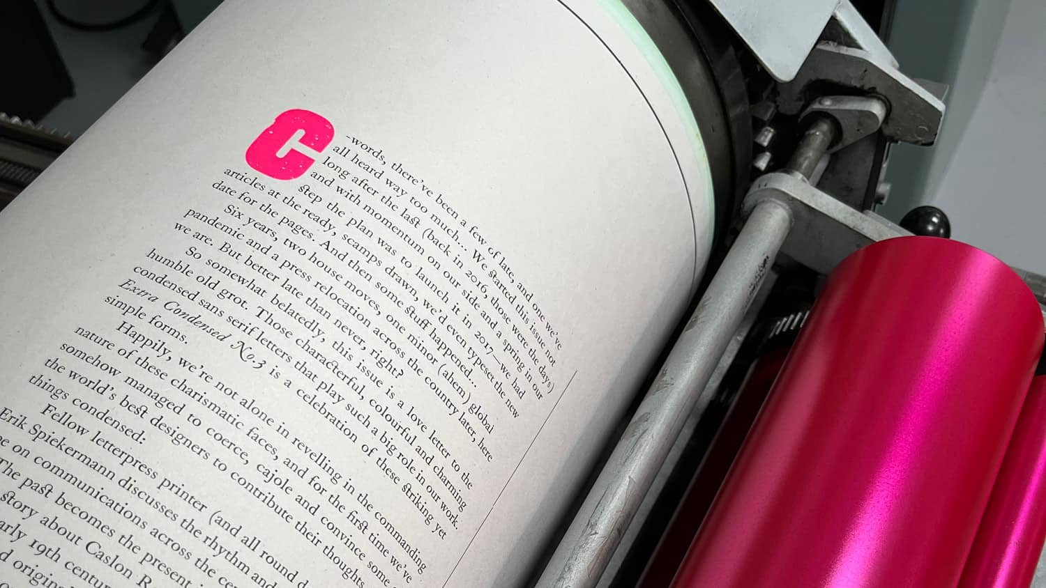
Extra Condensed No.3 launched at the end of last year, after some six years in the making. Quite a bit longer than we’d planned. In our defence, the writing and planning were completed almost five years ago, but then some things got in the way. We moved house, across the country, and then covid-hit… and everything stopped. Including moving the press the 152 miles to join us. After the much delayed relocation of the workshop was complete at the start of last year, we were finally ready to go again. So in reality the design, typesetting, printing and collating perhaps only took nine months of those six long years.
Now, forgetting the delays, nine months may still seem like a long time to produce a 12 page newspaper, but letterpress is a slow and fickle process, especially when everything is done by hand. Happily for us, much of the joy is in this slow process. So we wanted to share a little behind the scenes of the work and craft involved in creating this issue.
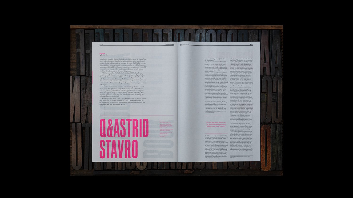
This time around the writing was, thankfully, taken care of by our stellar list of contributors, so we’ll skip straight to the design process – which begins with pencils, paper and, occasionally, pints.
As with everything we do, it starts with sketching: drawing out ideas and layouts, throwing thoughts around over a few weeks, putting them down and leaving them, only to come back to them with fresh eyes and revise and improve as we go. One of the great things about this process is that it can happen anywhere, including the pub. Which is still a great place for thinking with a sketchbook.

Sketches begin loosely before we start to fill in the details
With a broad design in place, we then have to work out what is achievable in reality—we only have a finite amount of type, in a finite range of sizes and styles at our disposal, and so the challenge becomes making our original sketches happen using only the tools we have available. This inevitable involves some tweaking of plans at this point, and occasionally a complete rethink. Sometimes the type we have has to lead the design, which for us is an interesting way of working.
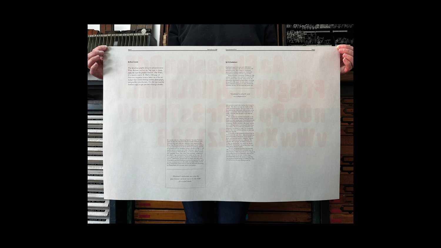
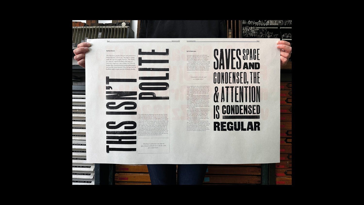
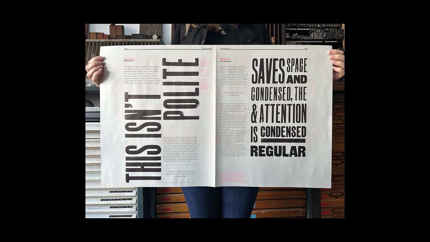
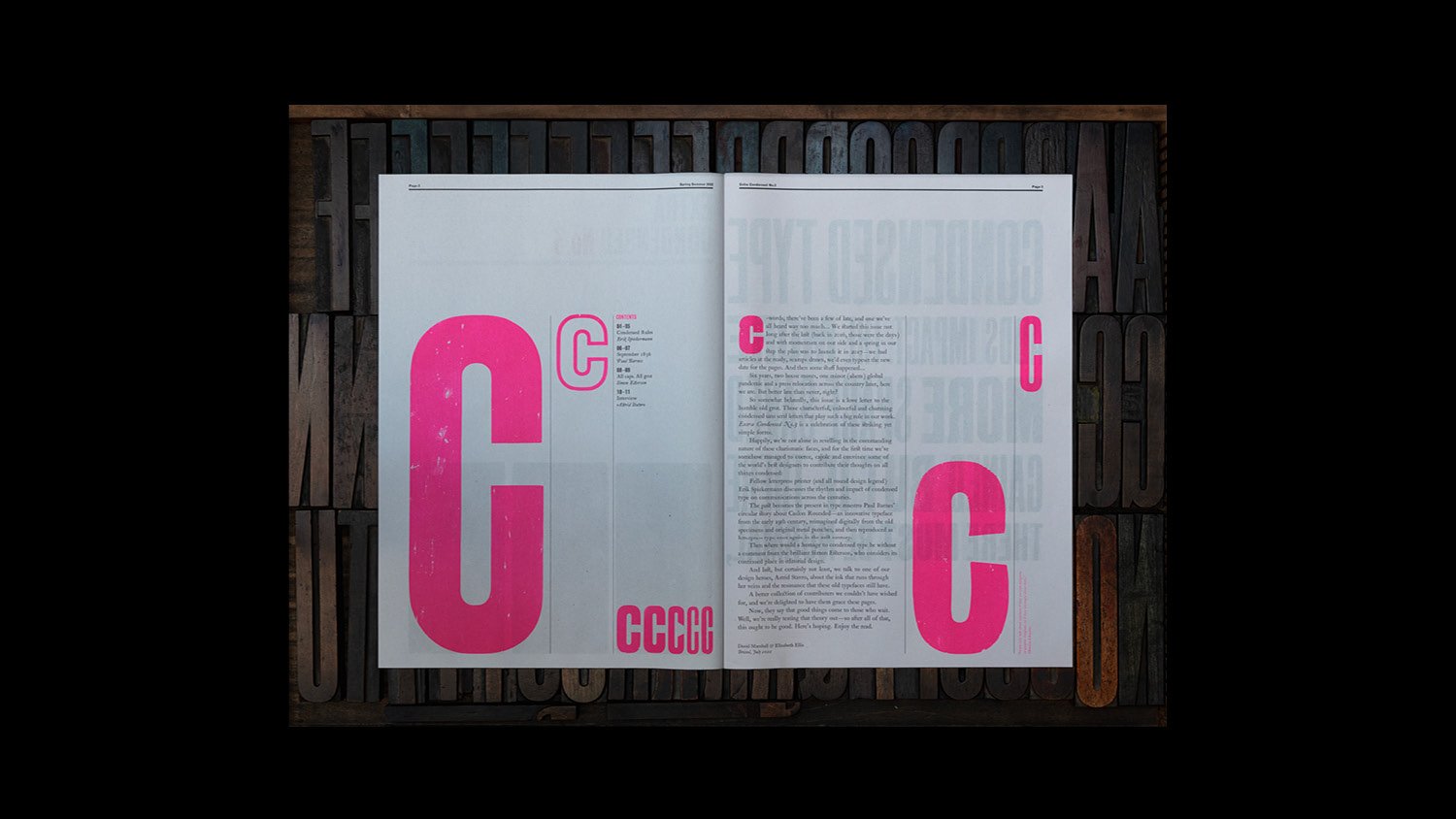
The structure of the paper is held together by a 3 pica grid and some clear underlying principles which guide and unify the design. Some things are fixed, for example body text will be set in 12pt and 18pt Caslon on 2pt leading, with columns are generally 20-pica wide for 12pt type (although this is flexible if needed), and we have a several hanging heights to start from. Everything else is driven by the content and the design.
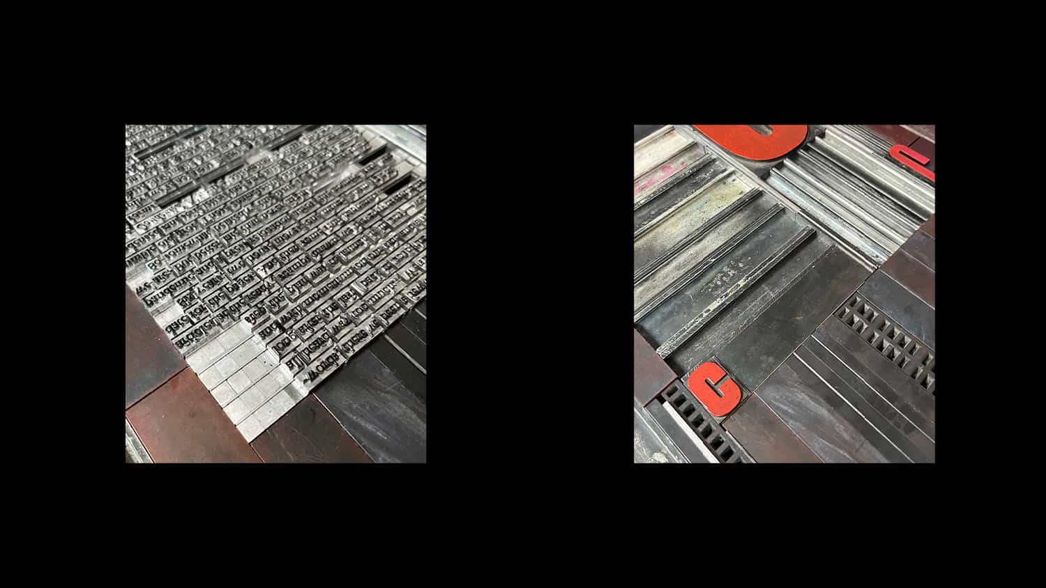
For the main text, we start with the metal type: typesetting the article character by character, all by hand. When we want to change to an italic, we have to open another case; small caps are another case again, and these are letter spaced with slivers of brass and copper—just 1 and 0.5pt thick; any swash characters or ligatures also have to be sought out especially. To put this into context, Paul Barnes’ article totalled 4,418 characters, not including the spaces. That’s 4,418 little bits of metal type.
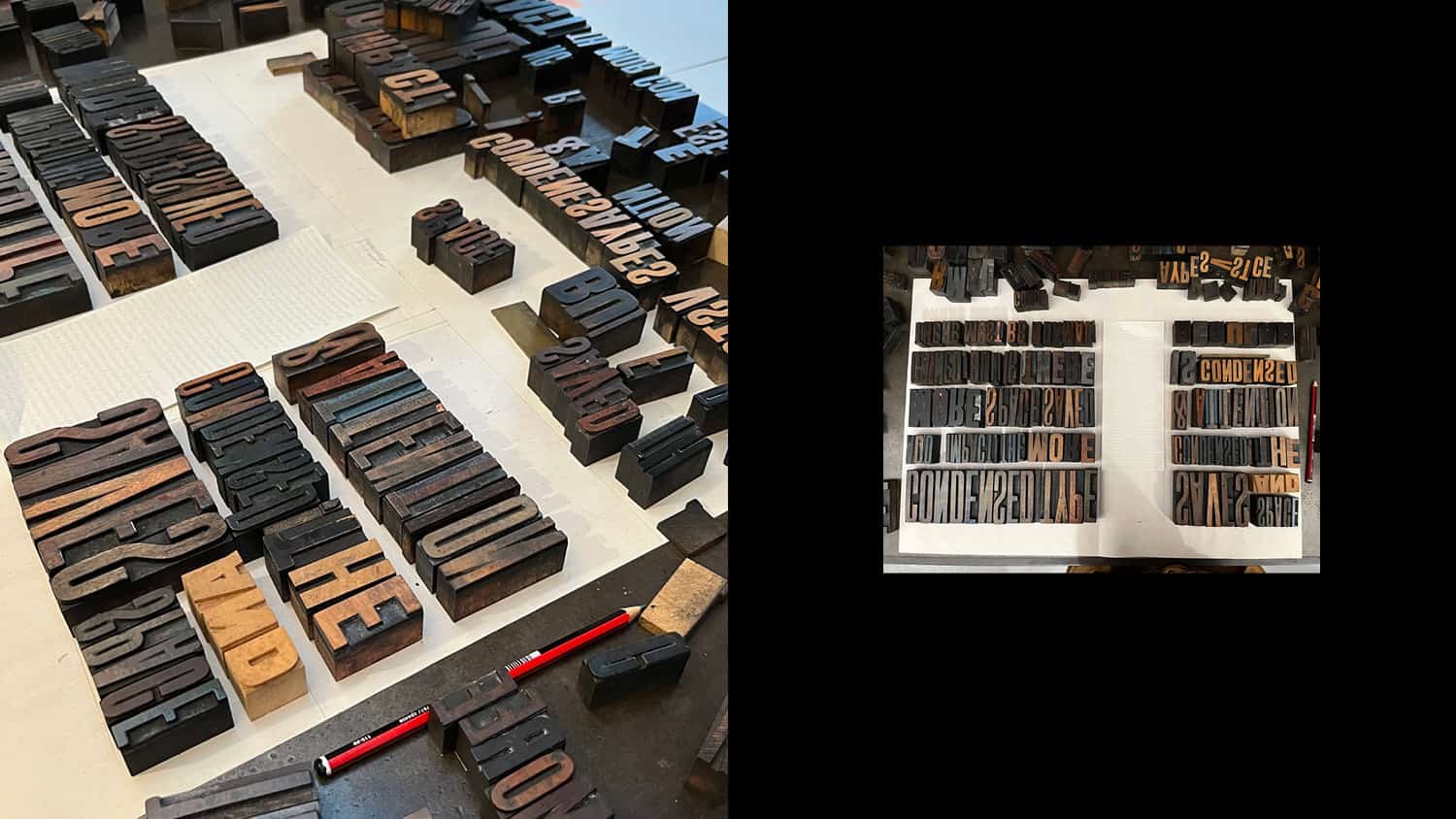
Once the metal type is set, it is proofed on a Farley galley press and checked for typos and damaged characters, of which there are always a few. Next we move to larger metal and wood type, and the layout starts to take shape. For each spread, we’ll take our sketches and work out what type will get us as close to that design as possible.

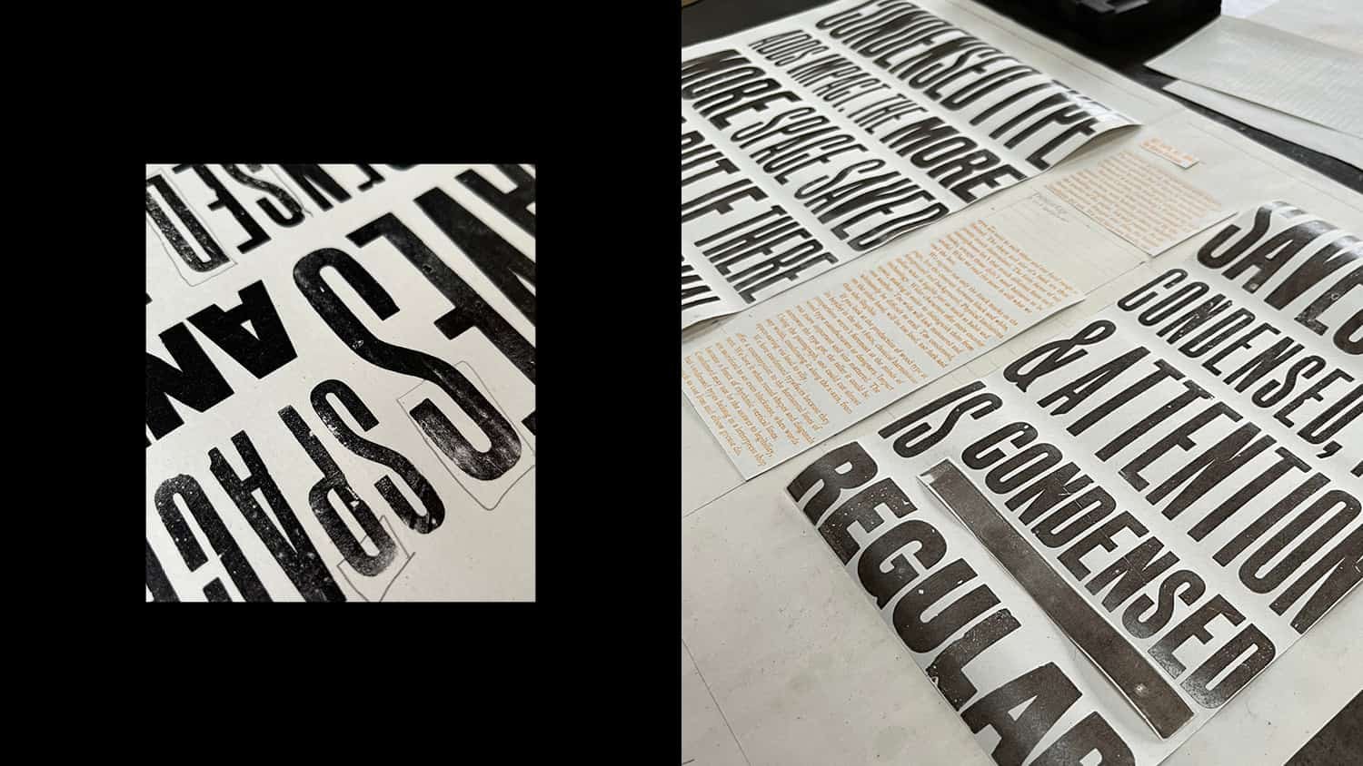
Swash caps and italics need different cases to roman type
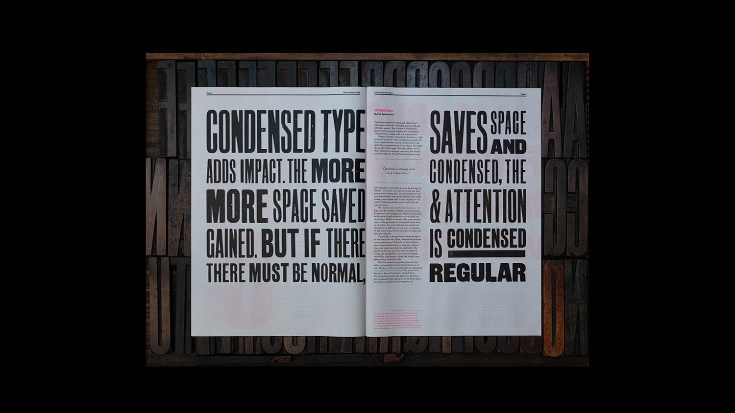
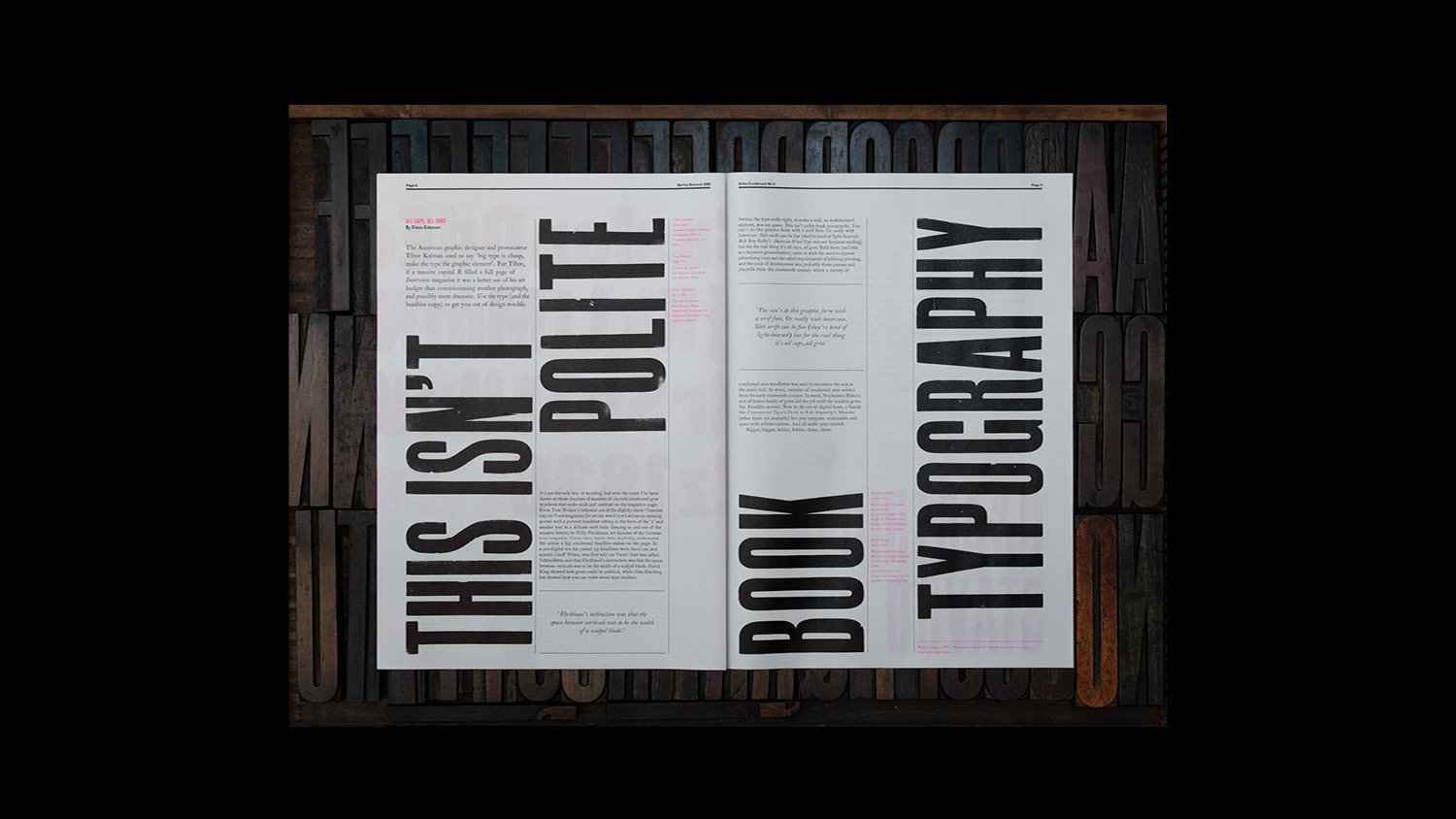
In his article, Erik Spiekermann talks about condensed type adding impact and creating “a fence of rhythmic vertical lines”—and so we wanted to bring this idea to life in the layout. But creating a fence of wood type that fits the page width and depth perfectly is far harder than it appears—the type can’t be squashed or stretched, or made just a little bit bigger or smaller to fit a space. This meant getting out almost all of our sans serif condensed wood type (around 10–12 different fonts in various sizes and widths), and experimenting with different combinations. This took many attempts, alongside some thinking around the problem: if didn’t have the right size type, we introduced an underline; if we didn’t have the right amount of letters, we rearranged things so that the same letters could be printed again on the other page. What would be a relatively simple job on the computer took us days to get right in manually.
And then there is the make ready (sticking slivers of paper in different thicknesses the back of type to bring it up to type high) to make sure each letter prints as perfectly as it can. There is no quick way to do this, and with large amounts of wood type, it takes hours to get right.
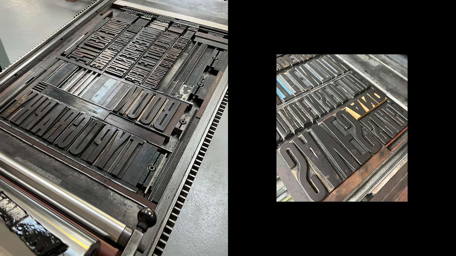

Switching formes and moving type requires a lot of planning
The added complexity of building the layouts is working in printers’ spreads – where each double page spread is split and printed with half of another spread. This requires working with two spread designs at once – simple enough to do digitally, much more tricky when swapping pages around involves moving several Kgs of type.
Once the type is set, the spreads have been constructed, each colour must be set up and printed as a separate forme. Within this, large wood type can’t be printed with small metal type, as one needs much more ink than the other, so formes are divided further by size of type. For example the large 70-line C on the contents page couldn’t be printed with the 14pt Stephenson Blake Condensed Sans No. 7 title, even though they are the same colour.
The result of this process means that each double page spread required 3 individual formes and each sheet of newsprint went through the press six times. To make those 12 pages, in an edition of 150 copies, involved 18 different formes, 450 sheets of newsprint, and 2,700 hand-pulled prints.
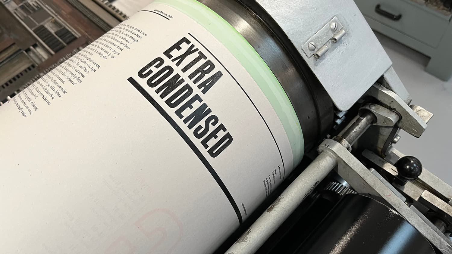
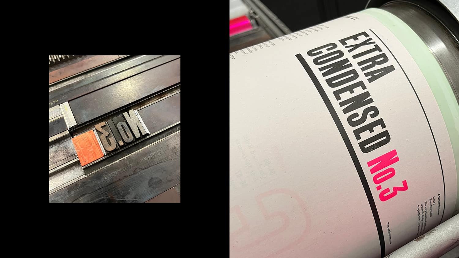
We always save printing the cover of Extra Condensed until last, partly so we can add anything to the colophon on the back page (which is printed at the same time), but mostly because printing the masthead feels like a sign off to the project. Then, once the masthead is printed, the 6-line Stephenson Blake Condensed Sans Serif No.14 that spells out Extra Condensed is taken off the bed of the Vandercook press and locked up again in a chase ready for envelope printing on our treadle press.
Printing finished, the final part of the process is the folding, collating and editioning. The large format and thin, flyaway nature of the newsprint makes this a fairly physical and slow affair, but this is the moment we see all the thinking, designing and long days come together. Until this point, we have never seen a complete version and have no idea if the last nine months have been completely successful—no amount of sketching, mock ups and proofs can really show you what the finished piece will look like. After all of this, we go back to the pub to celebrate.
Extra Condensed No.3 is available to buy now