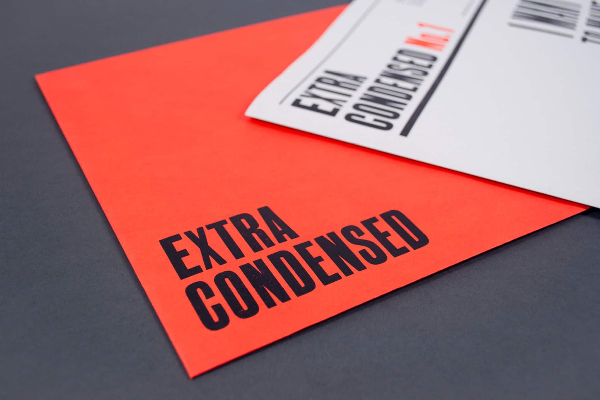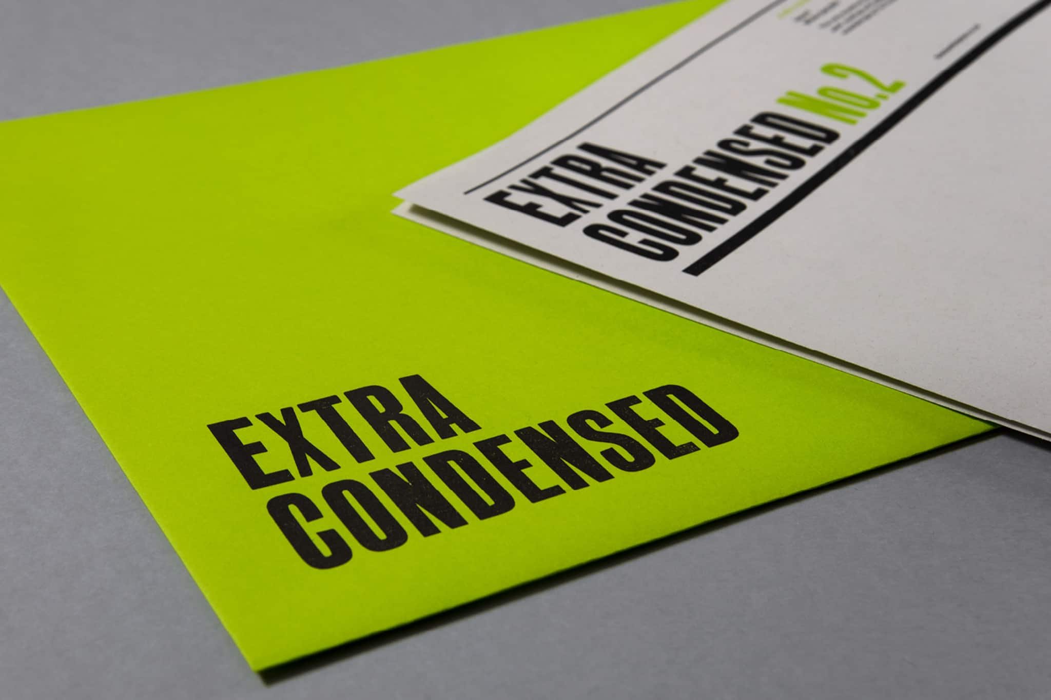
Extra Condensed No. 1

It began as a simple challenge to ourselves; how can we create something new and relevant using only traditional materials and processes, and how can we make a piece of beautiful letterpress accessible and affordable to as many people as possible?
The answer was a newspaper.
The ambition became to produce an occasional publication dedicated to typography, graphic design and language – an ‘extra condensed’ journal in newspaper form – that would be available to anyone. It is, as far as we know, the only publication of its kind in the world to be designed, typeset and letterpress printed entirely by hand.
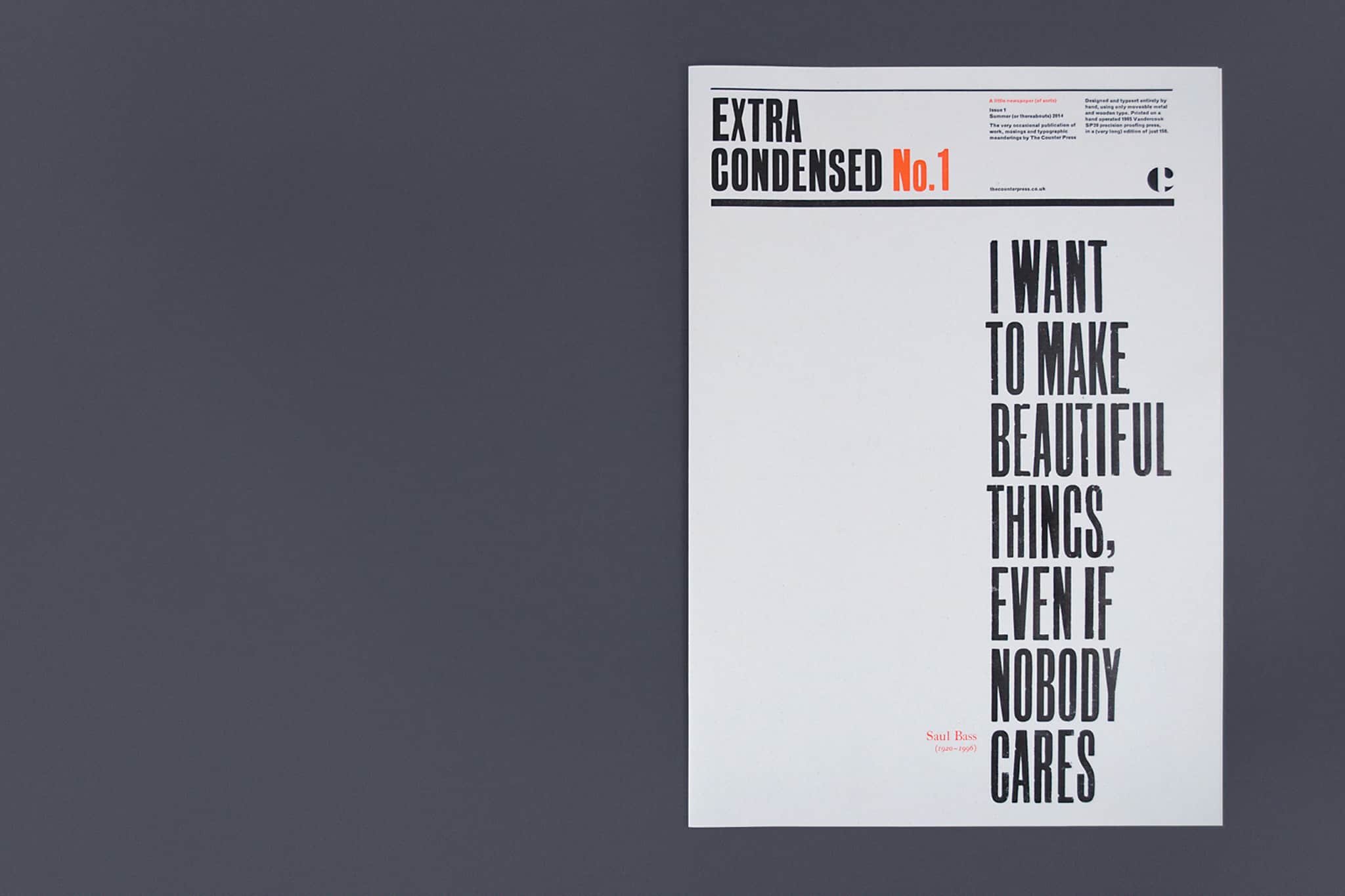
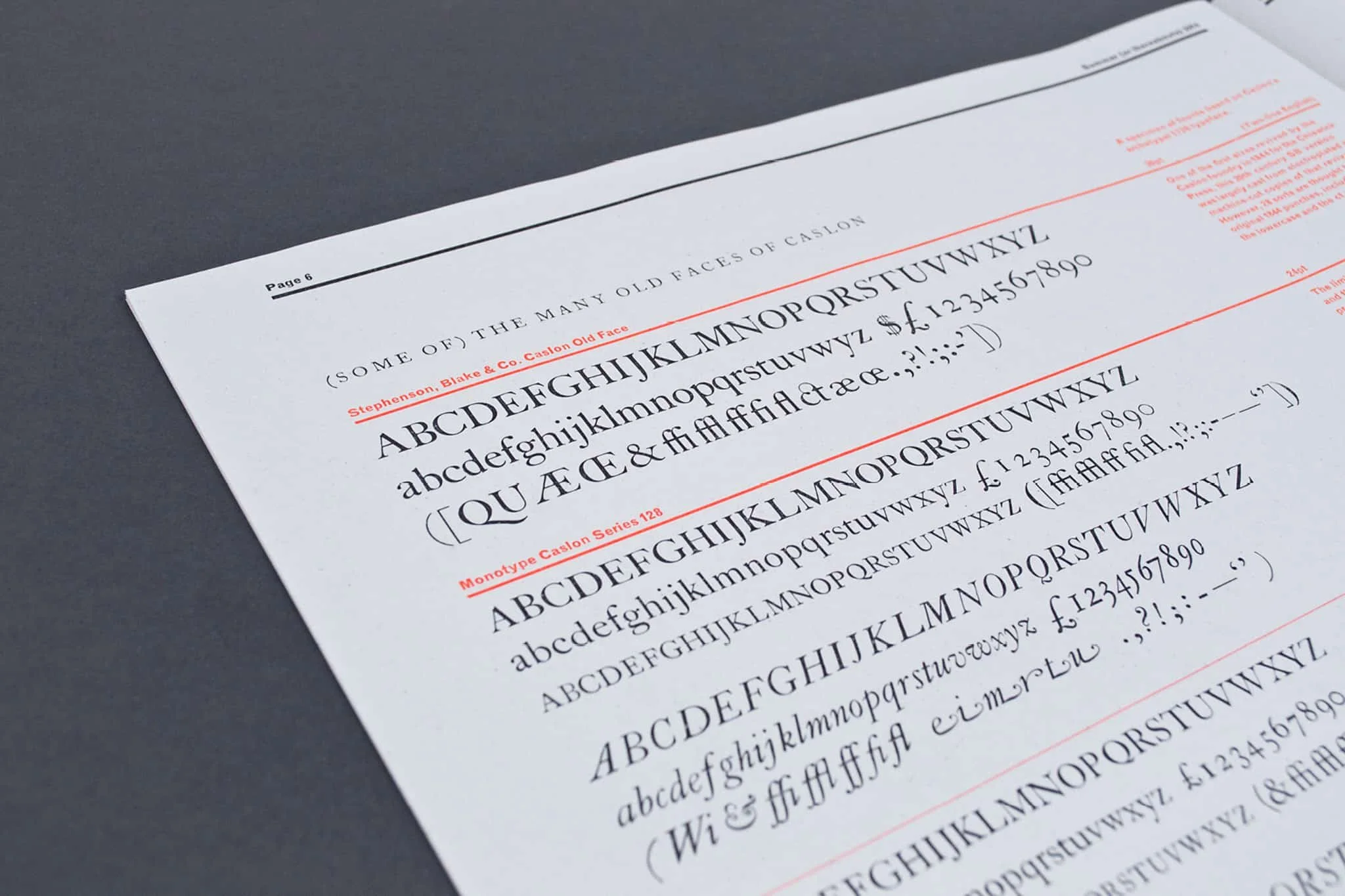
Once we had the format, the next challenge was content. We started simply with what we knew and things that interested us, and so articles include the first in a series of often misheard or misunderstood idioms that have been explored typographically, a short essay on the history of the tittle (the little dot found on top of an ‘i’) and a specimen of the Monotype and Founder’s Caslon held at The Counter Press. While the cover features a Saul Bass quote that came to sum up the initial ethos behind paper: “I want to make beautiful things, even if nobody cares.”
Extra Condensed started as something of an experiment: could we do it? And would anyone even be interested if we could? It quickly became obvious that this would need to be a true passion project if it was to be achievable: it turned into an immense amount of work, drawn out over a long period of time for what seemed like a relatively short edition of 150. But the result was something we felt was totally unique – something beautiful even if nobody cared. Issue 1 sold out within a week of launch.
COLOPHON
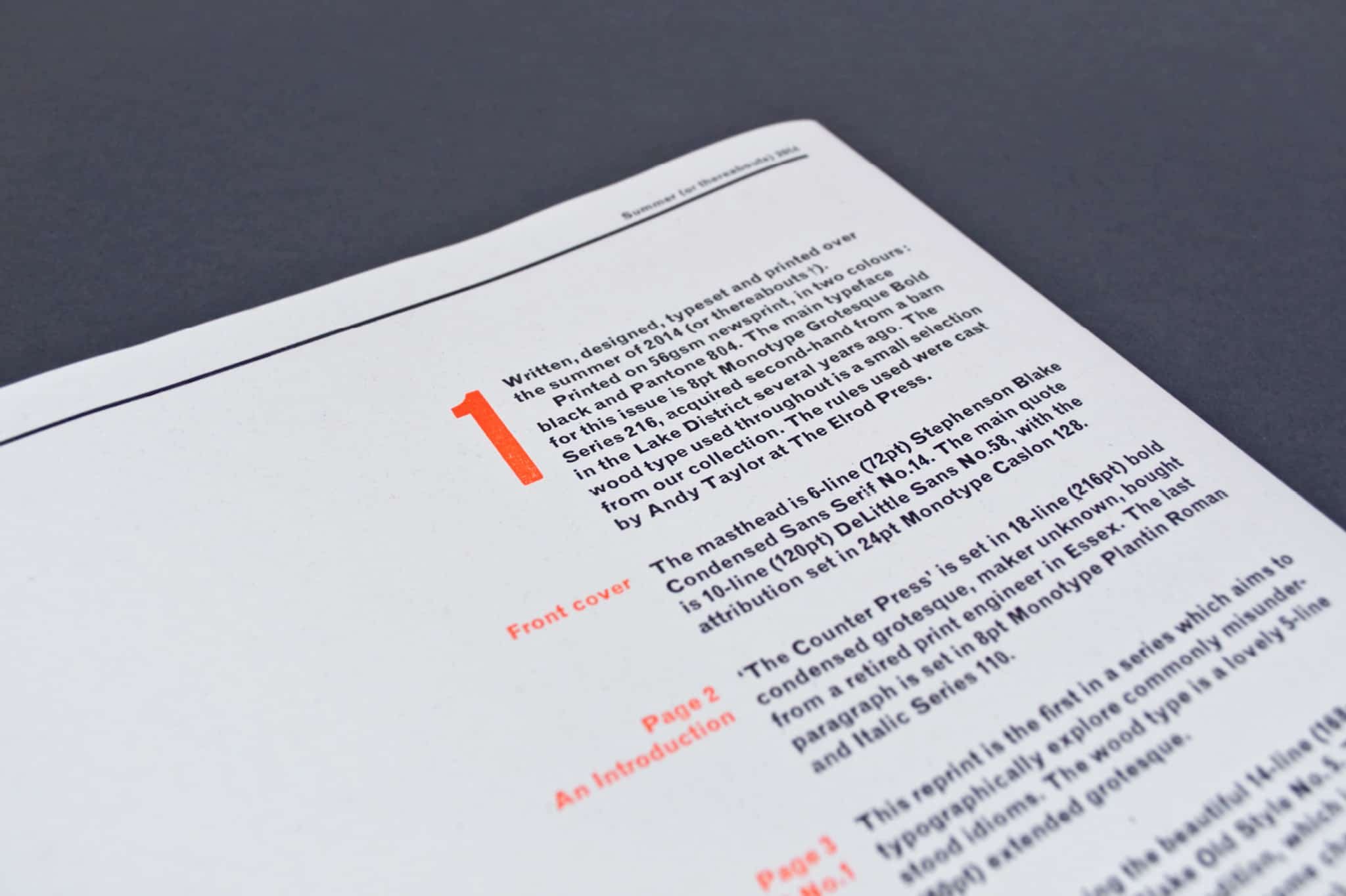
Edition of 150
8 pages
431 x 305mm
—
8pt Monotype Grotesque Bold 216
12pt & 18pt Monotype Caslon
Wood letter
—
Newsprint
Out of print